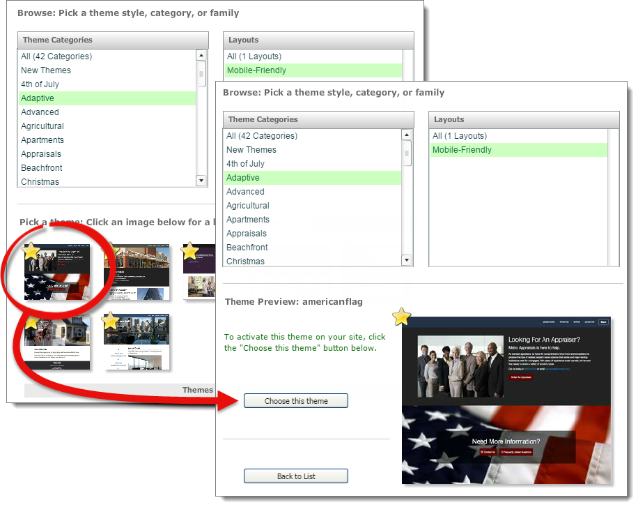

XSites also offers themes that adapt to display across all platforms — desktop, tablet, and even phone browsers. To choose a mobile theme:
That's it! your XSite is now adaptive and mobile‑friendly. Open your homepage in the Content Editor to edit it using the mobile‑friendly Inline Editor.
If you are switching to a mobile-friendly theme from an existing layout, your customized content is saved in the Content Clipboard. To access the Clipboard, go to the My Content section of the XSites Wizard, click Home to open the Content Editor for your homepage, and click the Content Clipboard button.