Create a mobile-friendly and adaptive XSite
This document explains how to set up a flashless, mobile-friendly theme that displays beautifully on mobile devices and adapts to large and small monitors automatically.
Document 7045 | Last updated: 09/05/2017 MJY
There are several modern XSite themes that allow your site to adapt to different screen sizes, large, small, and anywhere in between.
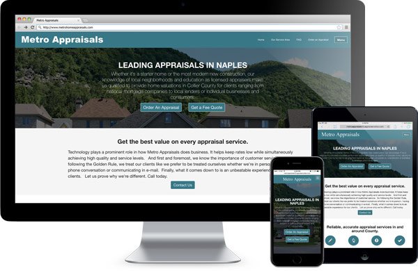
When viewing sites using these themes on a mobile device, your menus and text formatting are mobile-optimized. Likewise, if you view sites using these themes on large monitors at high resolutions, the site grows and contracts to better match the screen size.
Follow the instructions below to create a backup copy of your current site. Then, follow the instructions in part 2 to switch to a mobile‑friendly theme.
Part 1: Make a backup copy of your current site
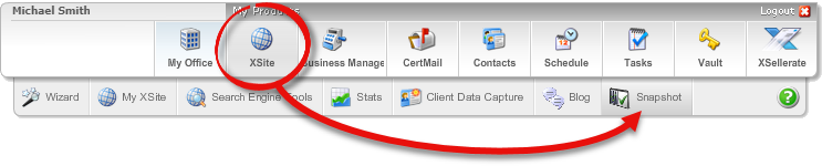
Before making changes to your site, take a moment to create a backup copy of your site in its current state using the Snapshot feature. This tool creates a backup of your current site and allows you to easily revert to a previous design if you make a mistake or if you want to start over.
- Once logged into your site, hover over the XSite icon at the top, then click Snapshot.
- Enter an optional name for the snapshot.
- Click Save Snapshot and stand by as your site is backed up.
Even if you don't create a Snapshot of your site, the Content Clipboard saves the contents of your old home page when you switch to a mobile-friendly theme. Click here to learn more.
Part 2: Switch to a mobile‑friendly theme
Switching to a mobile theme is the same as switching to any of our themes.
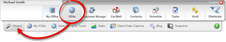
- Hover over XSite in the top menu bar and then click Wizard.
- Under Theme Categories on the left, click Adaptive (Mobile‑Friendly).
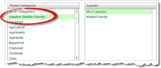
- Several themes are displayed. Click on an image thumbnail to view a preview of each theme.
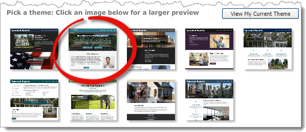
- Click Choose this theme to select it, or Back to list to keep looking.
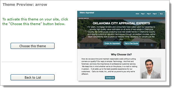
- With your new theme chosen, click Save to apply your changes.
- That's it! Your site is now mobile-friendly and adaptive.